Visual Hierarchy: Words & Pictures Poster
Communication Studio I Project 2: Visual Hierarchy
Project Overview
Visual hierarchy in any communications design form informs the viewer of how the information presented should be accessed. It helps with the organization of content, creating a path for the eyes to follow as the viewer visually moves through that specific design piece. From entry point to exit point, visual hierarchy ultimately provides clarity for the design presented.
In this project, I will be developing the skills for creating effective visual hierarchy through many typographic exercises. As a final deliverable, I will create a poster for the Pittsburgh Arts & Lectures program: Words & Pictures.
Questions to consider:
- What is most important?
- What is next important?
- How do you visually signal this?
- How do you use space, position, stroke weight, size, and color to create hierarchy?
Understanding Words & Pictures
Nov 5, 2020
After Vicki gave a quick introduction about this project and the elements of visual hierarchy–contrast, proximity, alignment, scale, and color–I started researching Pittsburgh Arts & Lectures and Words & Pictures to understand the context of what I will be designing for.

Pittsburgh Arts & Lectures
Pittsburgh Arts & Lectures is an organization that invites celebrated authors to the local Pittsburgh community. Its mission is to elevate civic discourse, inspire creativity, and evoke passion for literary arts. Authors that are invited typically speak on the topics of justice, compassion, citizenship, acceptance, courage, and equity; all of which are reflective of the organization’s values.
Words & Pictures
Words & Pictures is a program that brings in acclaimed children’s authors and illustrators to all readers. Due to the pandemic, all the events within the program are now being hosted virtually. In this program, authors talk about their most recent work to the audience. By examining each author’s work, I was able to find some common themes. All of them surround the topics of coming of age, the hero’s journey, humanity, or hope.
Three Adjectives
Wholesome, Moving, & Hopeful
Describing Words & Pictures in a Sentence
Words & Pictures connects renowned children's authors and illustrators with the local Pittsburgh community, providing a wholesome experience for readers of all ages.
Hierarchy with Simple Typographic Elements
Nov 9, 2020
In this phase of the project, I transitioned from researching to analyzing and determining the hierarchy of the information provided.

Looking at Existing Hierarchy
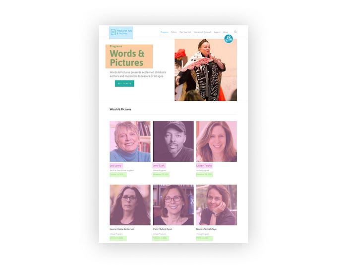
I began this process by looking at the Words & Pictures section on Pittsburgh Arts & Lectures website. Although my poster’s use of color and visual hierarchy will be based on MY OWN interpretation of the event (NOT from the website), quickly examining the website could still be insightful to the understanding of the program’s context.
Determining What’s Important
To decide the information hierarchy, I asked the following two questions:
- Who is this information curated to? Who is the general audience?
- What information will the general audience prioritize? What do they value?
By considering these two questions, I hoped that the hierarchy of information will become clear.
Who is the Audience?
Although Pittsburgh Arts & Lectures marketed Words & Pictures as a program for “all readers,” the program would probably attract parents with young children since the main focus of the program is on children’s authors and illustrators.
What Infomation does the Audience Value?
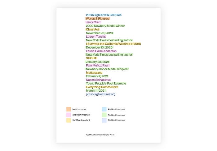
The most important information for anyone looking at this poster is the name of the program. Even though the program’s title, Words & Pictures, does not give much into its content, it serves as a keyword for associating the following lists of events with. This helps lower the cognitive load when the viewers try to recall the information they just received. Without a title, they would have a hard time finding more information or registering for the program online since there are no specific keywords for them to search up. The second most important information would either be authors’ names or the titles of their recently released books since these are the main focus of each event. Following that would be the dates of the events and the awards each author received.
Exercise 1: Stroke Weights, Linespacing, & Horizontal shifts
After identifying the hierarchy, I then began doing the first exercise, using stroke weights, linespacing, and horizontal shifts to create hierarchy.
Constraints
- Use an 8.5 x 11-inch paper in vertical orientation.
- Content in text form must be flushed left and ragged right.
- Use the typeface Neue Haas Grotesk Display Pro with 4 font options: Light 45, Roman 55, Medium 65, & Bold 75.
- Set type to size 17 with 21 leading.

Stroke Weights
Instruction:
Select any two stroke weights. Select certain lines of type to make bolder, basing your decisions on content hierarchy. The full line, not individual words, will be bold. No linespacing or shifting the type.

I experimented with using the difference in stroke weights to highlight certain information, pairing 45 with 65 and 55 with 75. I believed this was the optimal interval for the weight difference.
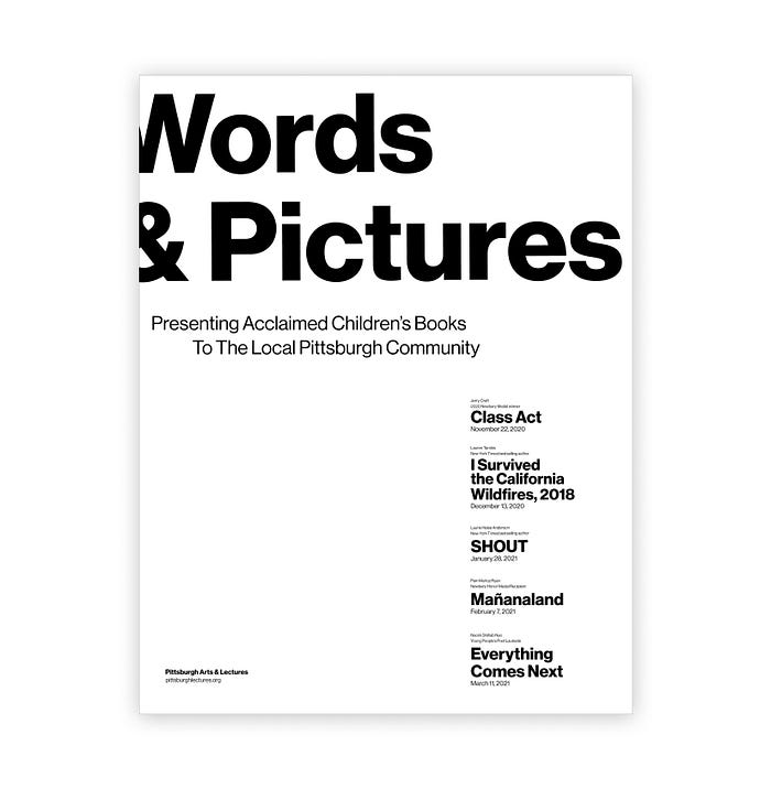
From this activity, I decided that the third one had the most effective visual hierarchy. It utilized the 75 Bold as the heavy stroke weight and the 55 Roman as the lighter. Using 75 Bold just for the program’s title and authors’ names–6 lines of the 23 lines–seemed to be the right amount for visual balance.

Linespacing
Instruction:
Insert one linespace (the return key) between any two lines of type,
based on hierarchy; you may do this as often as you wish. You may not insert more (or less) than one linespace between any two lines of type.

Looking at the iterations I made, I was drawn to the first one the most. Using linespacing, it grouped the information into 5 main chunks, separating the 5 main events from each other. Its simplicity helped create clarity that was lacking in other iterations. I also used 55 Roman for this specific iteration.

Horizontal Shift: Two Flush-Left Margin
Instruction:
Select one stroke weight. Shift lines of type horizontally left or right, using the tab key, resulting in two flush-left margins. No linespacing.

The first iteration was the most successful since it used alignment to separating the authors’ names and the program’s title from the other details. It is communicative in emphasizing the most important information.

Horizontal Shift: Three Flush-Left Margin
Instruction:
Select one stroke weight. Shift lines of type horizontally left or right, using the tab key, resulting in three flush-left margins. No linespacing.

For this last exercise, I was most drawn to the 5th iteration. The use of the 3-flush margins allowed for more subtlety in the hierarchy. In this iteration, I was able to create better distinctions between the books’ titles and the date that I couldn’t achieve with the 2 flush-left margins.

Combining Typographic Elements to Create Hierarchy
Nov 10, 2020
From today’s class, I was able to see different people’s explorations as we all chose our best 3 compositions for each exercise and put them on a shared Figma board. We then did an exercise, combining the different typographic elements–stroke weight, linespacing, and horizontal shifts–adding more complexity and clarity to the hierarchy of our respective information.

Seeing everyone’s work, I realized that I could have been way more playful with my work. My process was very logical, yet it could have been more interesting. Even though I could only manipulate 4 aspects of the visual hierarchy, I had more agency over the layout than I thought I did. Be bold and unconventional !!!
Things to Consider
- Take more risks. You’ll never know if an idea works until you actually try it out.
- Use customized tab size to increase visual variation.
- Move away from the top left corner!
- Print out iterations as the final poster will be in print.
Playing with Colors
For this part of the project, I started exploring how colors can aid hierarchy. In class, Vicki introduced us to the basics of color theory. She showed us how different aspects of color–contrast, hue, saturation, luminosity, and transparency–can affect the hierarchy and readability of a poster.
Transitioning from class, I started collecting color swatches for my poster. To begin, I asked: What colors would help convey the feeling of the poster best? As the adjectives I chose were wholesome, moving, and hopeful, I believed that most colors on the poster should be bright and light. Colors with these qualities can help create a sense of softness and gentleness and are generally associated with children.
Once I had a sense of what colors could work, I looked through the magazines available in the studio to create some color swatches.
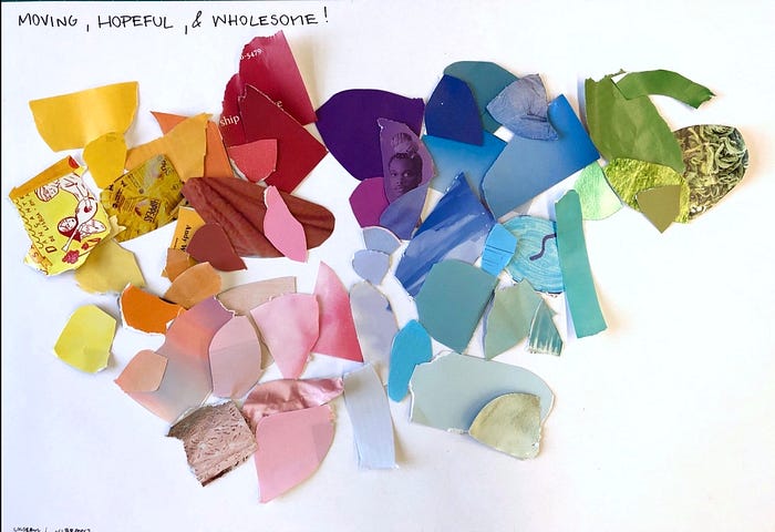
I then paired different colors together, keeping in mind the 7 types of color contrasts.

From this exercise, I was most drawn to the swatches with different combinations of pink, blue, orange, turquoise, and yellow. Light pink and light blue are two very classic children’s colors that resemble the wholesomeness of the event well. Turquoise, yellow, and orange can add brightness to the poster, producing a sense of hopefulness.
Exercise 2: Color & Everything Before
Instruction:
Explore how one color can help complement your hierarchical decisions.
Try color in the type in addition to black. Start with one color. Sparingly.
See how/if color can emphasize hierarchy. Next, try color behind the type; it can cover all the background or a part.
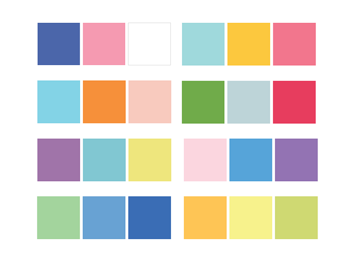
Based on the color collage I made, I created my color swatches in Illustrator. I then started experimenting with using a single color in type and or in the background. Afterward, I applied color to both the text and the background.


Exercise 3: Size Change & Stroke Weights
Moving on from color, I looked at how scale can affect hierarchy.
Instruction:
Select any two stroke weights.
Use a change of point size to emphasize hierarchical differences.


For the first sets of experiments, I mainly used stroke weight to emphasize the name of the event. However, after looking at them from afar and asking my peers for some feedback, I realized that the name of the event is not that attention-grabbing and doesn’t provide much context for the event. The words “words” and “pictures” are too vague. For the last two iterations, I tried to emphasize the names of the books instead as names like SHOUT and I Survived the California Wildfires of 2018 are more attention-grabbing. I also tried to implement the grid system to make my poster more cohesive.


Things to Consider
- Scale is still too similar throughout the print. Challenge your intuition and push the boundary more. Can things be extended off the page??
- Maybe add a sentence that describes the event can help with the clarity and context since the meaning of the name is so vague.
- Consider white space. How does this affect the hierarchy?
I created another iteration of the scale exercise, applying these points talked in class.
Using Imagery
Nov 12, 2020
In class, Vicki introduced us to the use of imagery in posters. Images should always enhance the meaning of the content, or else, they would be useless. Cohesion between image and text can be achieved by allowing images to guide the form of the text.


Exercise 4: Image
Instruction:
Consider the role an image might play in communicating the content’s message. An image may be photographic (abstract or representational) or
graphic (drawn, painted, or computationally generated).
Move from letter-size to tabloid-size paper.
After class, I began looking for images that would compliment my text. Some of the keywords I used were kids, reading, books, and looking up as they helped me to find pictures related to the content or the feelings of the events.


In this set of posters, I mostly let the picture guided how the text should be laid out. I also made some micro changes to the hierarchy such as putting the date on top, splitting the title, and playing the leading size. The posters that I liked from this set of explorations are the first two.
In the first poster, I tried to challenge the convention by arranging the information diagonally across the poster. I also use the steps on the stairs as columns which created cohesion between text and picture. For the second poster, I really enjoyed the gaze of girl. It is very hopeful and innocent, which fitted the theme well. I also liked how her gaze led to the title of the program. The subtle interaction between the “P” and “i” in Pictures with the image also add more depth to the poster.
Feedback On Poster 1

- Picture is to too smack dab center. The stairs is cutting through the middle of poster.
- The bottom half of the poster might be too busy and confusing.
- The picture, overall, might be too busy.
- Authors’ names are too small. They are important too!
Feedback on Poster 2
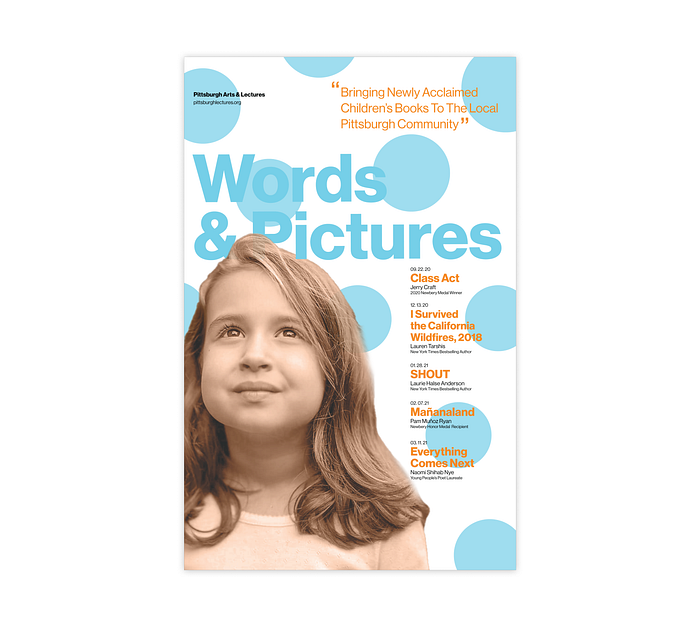
- Smallest font is too small.
- Since the title is blue, it is getting a bit lost in the background.
- Can the colors be more playful? The complementary contrast between blue and orange is making the poster too stable.
Refining My Posters
Keeping the feedback I got in mind, I continued to iterate my posters. For the first poster, I mainly manipulated the background picture, playing with the scale of the kid and removing certain elements of the background, to achieve the right visual balance.
Poster 1


I ended up choosing this composition as I felt that removing the stuff at the bottom right corner made the picture too empty. I also liked how the wooden rails extended off the poster; overall, these elements made the image felt very cozy. This composition also followed the rules of thirds where the subject, the girl, is right at the intersection of two lines, creating a strong visual balance.
Poster 2


For this poster, I wanted to explore more with the subject on the poster. However, after trying two other kids on the poster, I realized that the original image of the girl and her gaze worked best. I then moved on to playing with color, using the color swatches I created earlier for the color experiment. One feedback I got was the blue and orange were not attention grabbing enough. To fix this, I played more with the contrast of proportion. From all the iterations, the one that worked the best was the one with the white background with yellow, pink, and dark blue. Using two warm tones and one cool tone added more dynamic to the poster, unlike the 1:1 use of warm and cool tones in the first poster. I then tweaked the spacing and font size to increase readability.


Thoughout this process of refining, I also printed my work and pin them up on the wall. Looking at them helped inform me what I still have to tweak to create an effective poster.
Final Two Posters


I decided to bring two posters to crit; however, for my final poster, I decided to go with the one on the left. Although I really the right picture and the unique distribution of texts across the poster, there were some micro elements that I still couldn’t resolve such as the right rag of some texts is too close to the beginning of the next column. I liked the hierarchy on the left one better.
Final Poster

Reflection
Looking back on this project, I am now more appreciative of beautiful and effective posters. Before, I didn’t realize how much thought is put into making a communicative poster that looks simple and intuitive from the audience’s point of view. Considering the different aspects that make up the visual hierarchy–scale, weights, color, and spacing–I can identify what makes a poster work and what doesn’t in a certain context.
Besides from the techinal aspect of the project, I also learned that as a designer, it is important to trust my sensibilities if I’m making informed and justified decisions. Since this project felt really new to me, sometimes, I get too caught up in other people’s feedback. Although there are certain things that make a poster effective, there are also a lot of room for subjectivity. I should be more confident in the decisions I make as the creator of the work.
